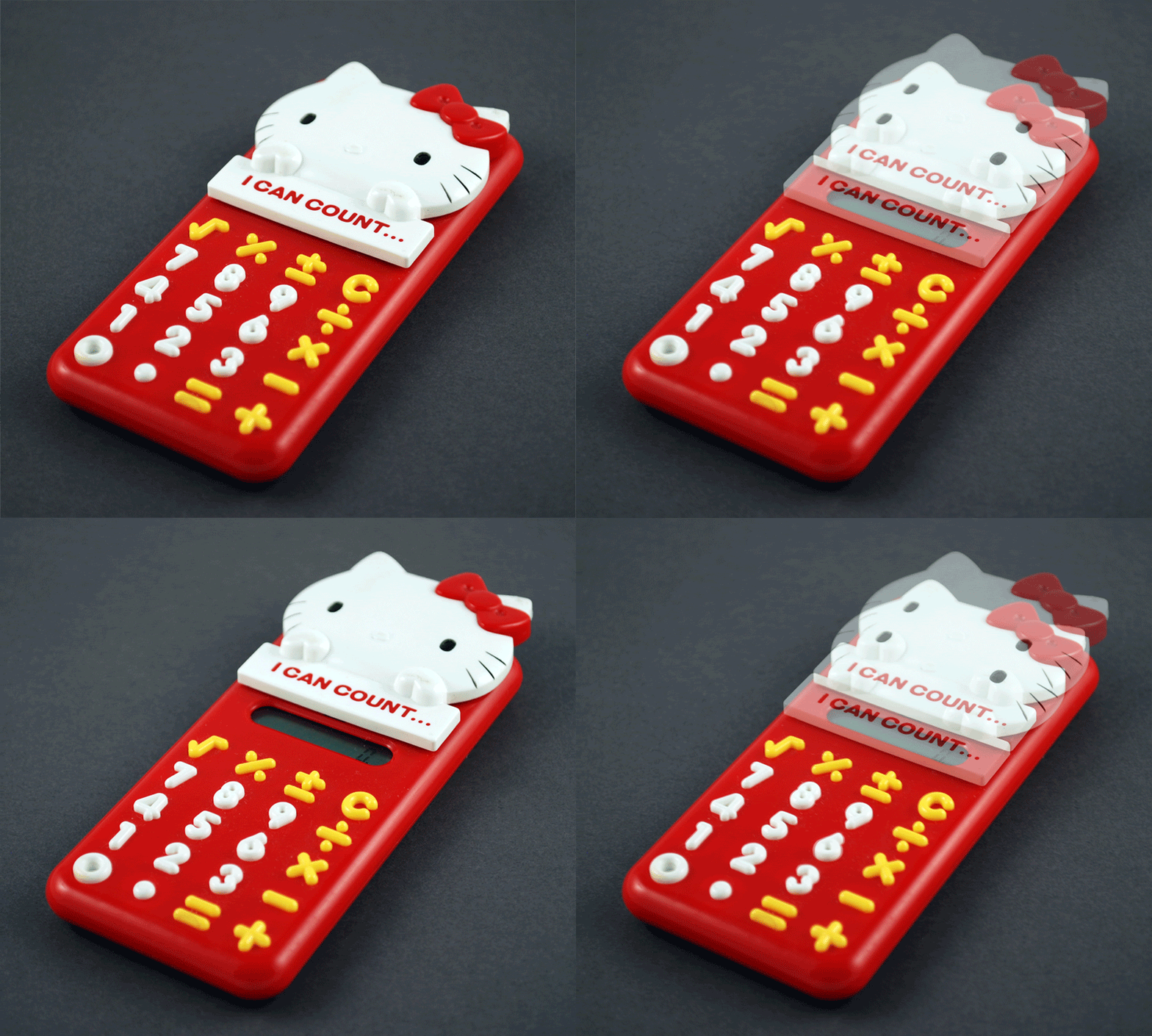
 I recently found my sisters old Hello Kitty calculator that I'm now using in the shop. It's a good example of a lot that I like about Japanese design.
Turning it on is really intuitive. When the head slides, it turns on and off. And if you forget it shuts off automatically, preserving battery life. The injection molding is well done. There are no rough edges or mismatched parts. And the buttons individually molded like the numbers and signs are great. It doesn't feel like a cheap product.
I've heard that the Japanese would make products for sale in the U.S. and similar product for Japan with tighter tolerances and a higher quality. I'm not sure if that still holds true, but that fits in with my design philosophy. I like to design, build, buy things that will last. I find them more satisfying to use and a longer life span should pay for the extra expense of a quality product.
You also have to admire the iconic power of the Hello Kitty brand. It's been around since 1974 and continues to grow in popularity.


